

Field Plugins
Field plugins extend the Visual Editor as standalone applications that Storyblok embeds in iframes. Use field plugins to build custom functionalities, such as integrating the Visual Editor and Storyblok’s APIs with third-party web services.
To maintain a legacy field plugin built with Vue 2.5 API, or migrate it to the field plugin SDK, refer to Field plugins (legacy).
Watch the video tutorial How to use Storyblok Field Plugin SDK on YouTube.
How field plugins work
Section titled “How field plugins work”Because Storyblok embeds field plugins in iframes, they run in a sandbox and can’t access the Storyblok frontend application directly. Instead, field plugins and the Visual Editor communicate across origins with window.postMessage. The Visual Editor can send events to the field plugin containing information such as the current content. Likewise, the field plugin can send messages back to the Visual Editor containing information such as updated content.
When creating a field plugin, you don’t need to learn exactly how this communication works. Storyblok provides the @storyblok/field-plugin library with an abstraction layer that exposes an object of type FieldPluginResponse. Its type property is loading, error, or loaded. Once it’s loaded, the object has two more properties:
FieldPluginResponse.data: An object that describes the state of the field plugin. When the Visual Editor sends a message to the field plugin application, the library parses the message and stores it in this object.FieldPluginResponse.actions: An object whose properties are functions that allow the field plugin application to communicate with the Visual Editor. When you call one,@storyblok/field-pluginsends a message to the Visual Editor through the iframe window.
Serving field plugins
Section titled “Serving field plugins”Storyblok hosts field plugins. Therefore, you don’t need to maintain any server infrastructure. You compile your application into a single JavaScript bundle and upload it to Storyblok. When a Visual Editor user opens a block containing the field plugin, Storyblok serves a minimal HTML document that contains a script element with the bundle.
<!DOCTYPE html><html> <head> </head> <body> <script> // Your code is inserted here </script> </body></html>Bundle all application logic, assets, and styles into this one script. The single bundle has the following consequences:
- Embed CSS within the JavaScript code, because you can’t link it with a link element. All field plugin starters use Vite and vite-plugin-css-injected-by-js to bundle the CSS within the JavaScript bundle. Another option is to use a CSS-in-JavaScript tool.
- Image assets must be Base64-encoded in the source code, because you can’t upload them to Storyblok with the field plugin editor. You can also self-host assets.
- Code splitting is unavailable, because the plugin must load all code from the same endpoint.
- All code executes on the client. For server-side code, you must self-host. Storyblok recommends serverless functions.
Features
Section titled “Features”Field plugins update content, accept options, open a modal dialog, select assets, and resize automatically.
Updating content
Section titled “Updating content”Editors use field plugins to update the content of stories. For example, if you configure a block schema with a custom field type named example, Storyblok stores the content that the field plugin produces as the value of the example property in the API response.
With @storyblok/field-plugin, use actions.setContent to update the content model, and use data.content to read the current content.
Options
Section titled “Options”Inside a block schema, you can pass options to the field plugin. Options allow space administrators to configure field plugins without modifying the underlying code. You provide them on a per-field basis. This is useful when you configure the field plugin differently across spaces or blocks. For example, in the Slider field plugin, different fields require different ranges.
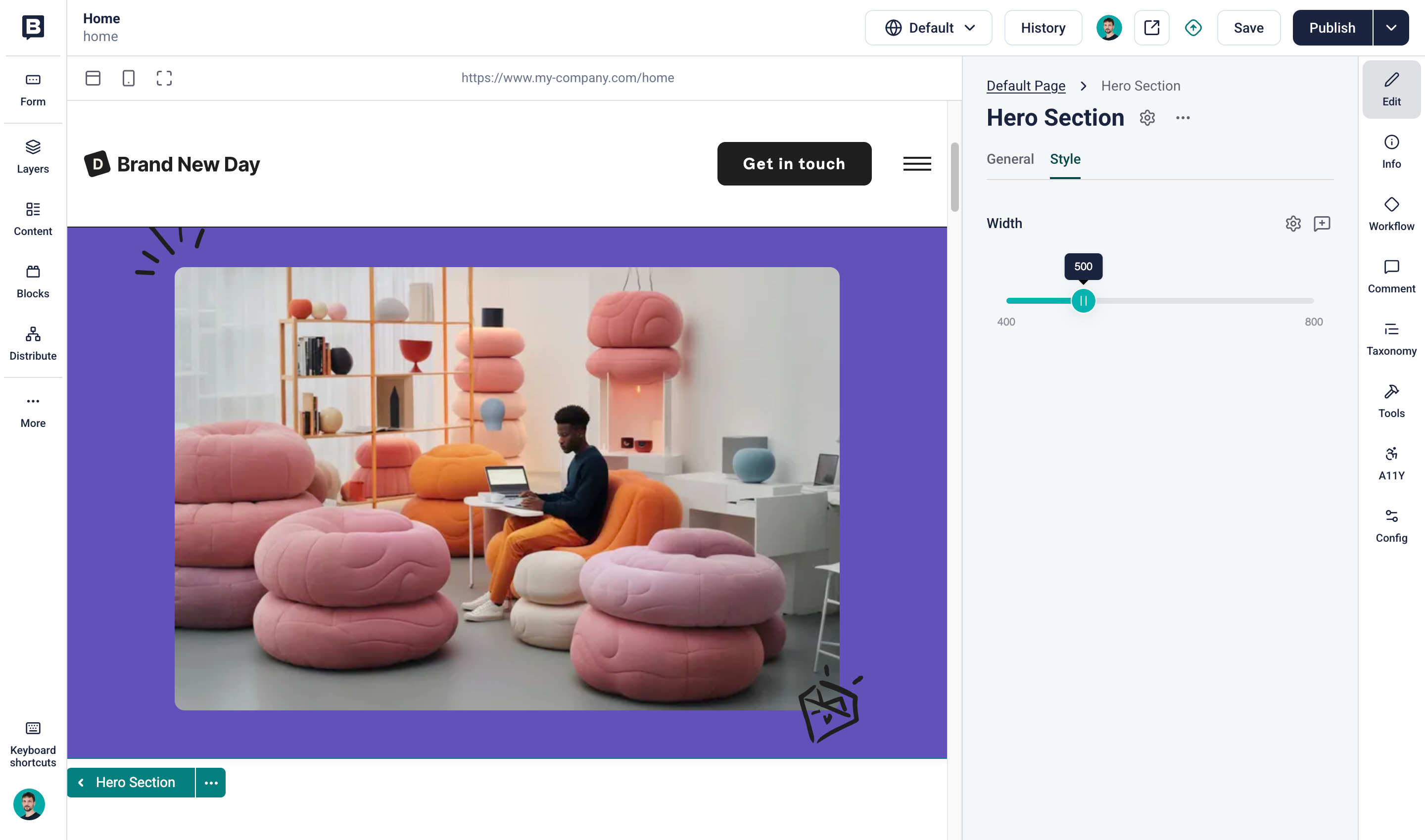
Options are key-value pairs where both the key and the value are strings. There’s no validation inside the Storyblok application, so validate the options at runtime in the field plugin in two ways:
- Validate that the option is present and provide fallbacks where possible. For example, the slider field plugin falls back to the range 0–100 if you omit the options
minValueandmaxValue. - Validate the format of the option. For example, the slider field plugin expects that the
minValueandmaxValueare numbers formatted as strings.
Inside a field plugin, read the options with data.options.
You can configure field plugins with default template options, which let space administrators identify the available options.
For security reasons, the option values that you define in the field plugin editor are accessible only during development. Once you add the field plugin to a story, Storyblok replicates only the option keys.
Modal dialog
Section titled “Modal dialog”Between other fields in the Visual Editor, the content form’s width limits a field plugin’s width. A modal dialog gives the plugin a larger surface when the user needs more room. For example, the Shopify field plugin lets the user search and pick products from a grid in a modal dialog.
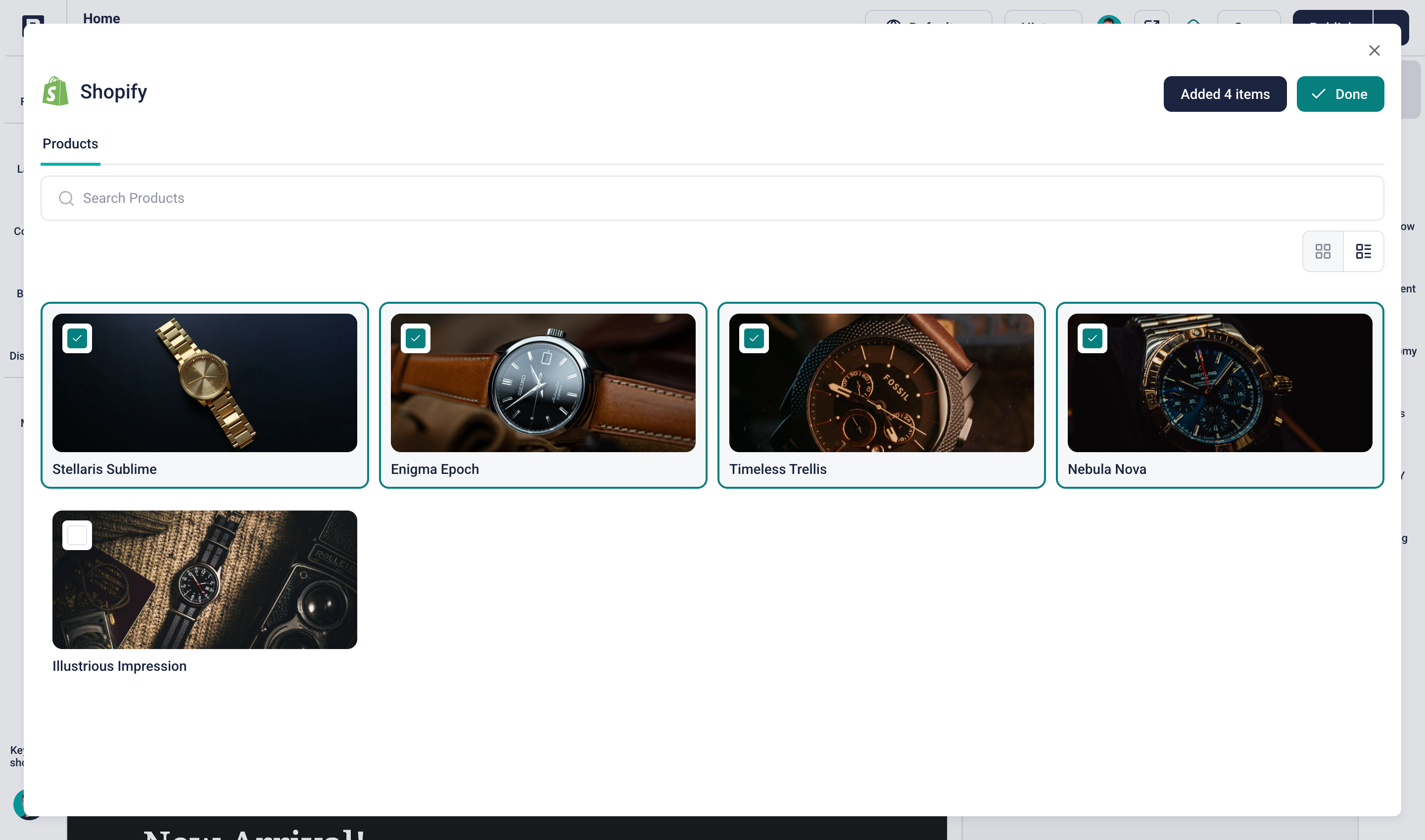
A modal window inside the field plugin application stays within the iframe element’s bounds, and an embedded application can’t open a modal window in the parent window.
To circumvent this, the Visual Editor makes the iframe element itself a modal window. By default, the Visual Editor positions the iframe relative to the neighboring fields. When the field plugin sends a message to the Visual Editor, the Visual Editor changes the position to fixed and maximizes the size of the iframe. Now, the field plugin can render itself differently, based on whether its position in the Visual Editor is relative or fixed.
With @storyblok/field-plugin, use actions.setModalOpen to open and close the modal window, and use the data.isModalOpen property to conditionally render based on whether the field plugin is a modal dialog.
Asset selector
Section titled “Asset selector”Field plugins that need the space’s assets can use Storyblok’s built-in asset manager.
With @storyblok/field-plugin, use actions.selectAsset to open the asset selector. The returned promise resolves with the asset object that the user selected. If the user closes the asset selector without selecting an asset, the promise doesn’t resolve.
Automatic resizing
Section titled “Automatic resizing”Field plugins vary in size, but iframes can’t resize to fit the documents that they embed.
The Visual Editor stacks the inputs for fields vertically. This includes the iframes that hold field plugins. The embedded documents can have different heights, so the iframe elements need to update their height when the user interacts with the field plugin.
Therefore, @storyblok/field-plugin listens to the height of the document. On change, the library sends a message to the Visual Editor, which sets the height of the wrapping iframe element.
Develop a field plugin
Section titled “Develop a field plugin”Create and run a field plugin with Storyblok’s field plugin CLI:
npx @storyblok/field-plugin-cli@latest createThe setup wizard asks for the following options:
- Package manager: choose
npm,yarn, orpnpm. - Structure: choose Standalone for one field plugin per repository, or Monorepo for multiple field plugins in one repository. If you’re unsure, choose Standalone.
- Name: enter a name for the field plugin. The examples on this page use
training-field. - Template: choose Vue 2, Vue 3, React, or JavaScript.
To skip the wizard, pass the options as flags:
npx @storyblok/field-plugin-cli@latest create --dir . --pluginName training-field --template vue3 --structure standalone --packageManager npmTo declare the options your field plugin accepts, add them to the manifest file, field-plugin.config.json. The Plugin Sandbox and the deploy command read the options from this file.
Run locally
Section titled “Run locally”Navigate into the newly created directory:
cd training-field/Start the application:
npm run devThe terminal returns a list of URLs. Open the Sandbox URL in your web browser to view your field plugin during development.

The Plugin Sandbox emulates the Visual Editor, letting you view the field plugin while developing.
Style the field plugin
Section titled “Style the field plugin”The Visual Editor renders a field plugin between Storyblok’s own fields, in a content form column about 300 to 450 pixels wide. To make the plugin look and behave like a native field, follow these guidelines:
- Use the editor colors: every template includes
src/style.css, which defines Storyblok’s colors as CSS variables, such as--sb_green,--sb_dark_blue,--light,--light_gray, and--white, plus tints with the_75,_50, and_25suffixes. Reference these variables instead of hard-coded colors. - Keep it compact: use small text in
--sb_dark_blueand borders in--light. Leave out headings, cards, and page chrome, and fit the plugin into the column without horizontal scrolling. - Style every control: give every input, button, and select element a Storyblok style instead of the browser default.
- Handle every state: show an empty state when the field has no value, and display validation messages inline, next to the input.
- Keep the editor usable: avoid
alert(), because it blocks the editor. For large interfaces, such as an image grid or a map, show a compact summary in the field and the full interface in a modal dialog.
The template’s example component demonstrates the SDK with headings and a card layout. Replace it with your own component.
The template’s src/style.css already styles checkboxes and radio buttons to match the Visual Editor.
Deploy
Section titled “Deploy”In the project folder, build the application:
npm run buildTo deploy the field plugin, run the following command:
npx @storyblok/field-plugin-cli@latest deployIf the environment variable STORYBLOK_PERSONAL_ACCESS_TOKEN isn’t defined yet, the CLI prompts you for a personal access token. To issue a new personal access token, open My account → Personal access token in Storyblok. The CLI offers to save the token to a .env.local file in the project. You can also pass the token with the --token option.
Choose where to deploy the plugin:
- My plugins: These field plugins belong to one individual user. Only that user can manage the plugin.
- Partner Portal: These field plugins belong to a partner account. Anyone with access to this partner account can manage the plugin.
- Organization: These field plugins belong to an organization.
Finally, choose a name. The CLI suggests the name from package.json. For a new field plugin, confirm the deployment. If a field plugin with that name already exists in the chosen scope, update it or create a new one with a different name. When you update a field plugin, the CLI asks whether to publish a new version, which defaults to no. To upload without publishing, pass the --no-publish option. If another account already uses the name, the CLI asks you to rename the field plugin.
Field plugin names are unique across all Storyblok accounts, so a name claimed by another account is unavailable. To avoid naming collisions, prefix your plugin with an identifier, such as acme-color-picker. Set the component’s technical name to match.
Field plugin editor
Section titled “Field plugin editor”After a successful deployment, you get a link to the field plugin editor, and the plugin is available in Storyblok.
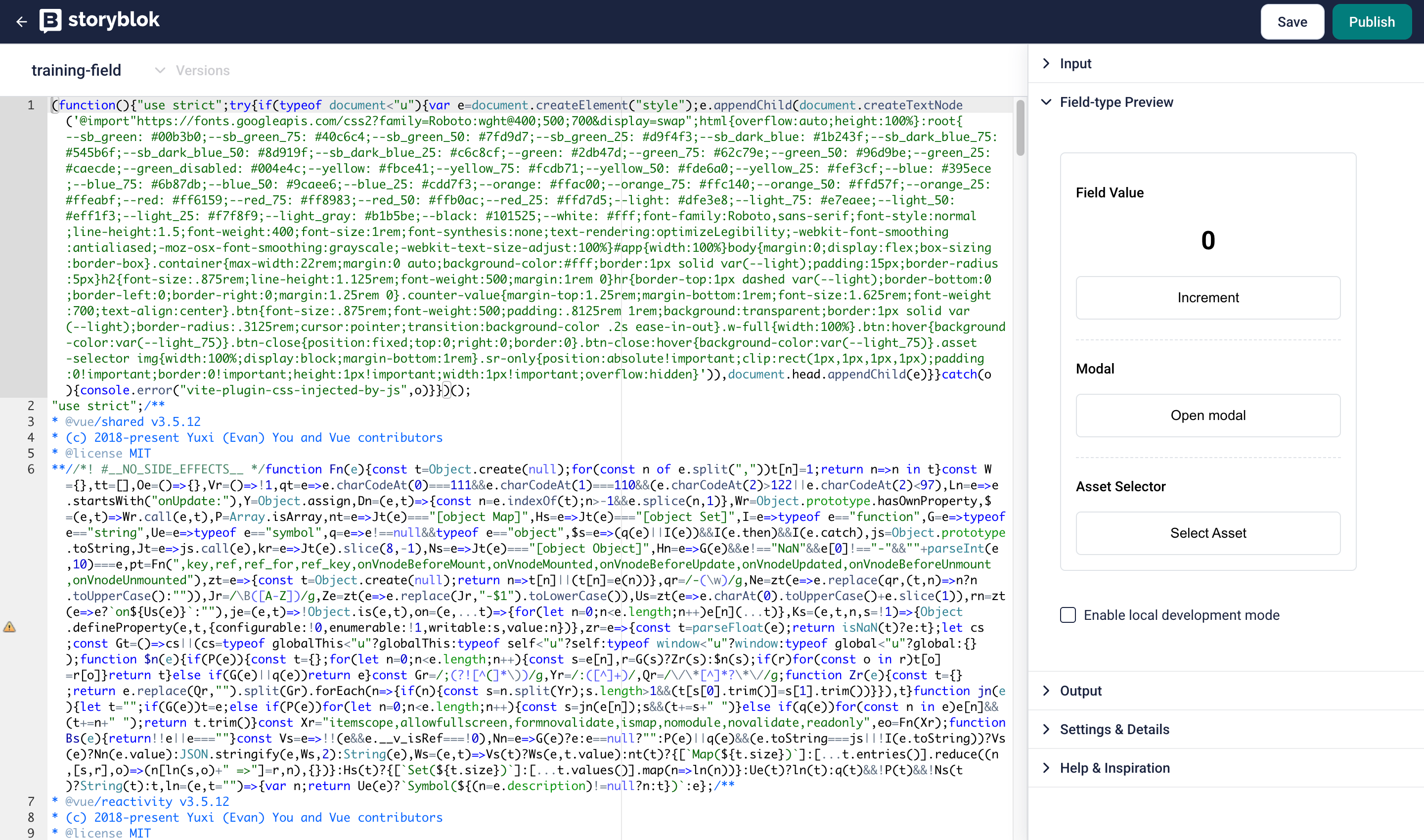
The text area on the left-hand side of the field plugin editor shows the content of the deployed bundle, which is the script that Storyblok inserts into the iframe document.
The Options section contains the default options and their values. The values are only accessible during development. The keys inform admin users in a space about the available options for a plugin.
Distribute
Section titled “Distribute”You can distribute field plugins through your personal profile, the Partner Portal, or the organization.
Personal account
Section titled “Personal account”Follow the steps below to distribute plugins from your personal account.
- In My account → My plugins, select the field plugin you want to distribute.
- In Settings & Details → Assigned Spaces, choose the spaces that should have access to the plugin.
To store the configuration, select Save. To apply the changes to the selected spaces, select Publish.
Partner Portal or organization
Section titled “Partner Portal or organization”To distribute plugins using the Partner Portal or your organization open Extensions → Field, and select Create new.
Name the plugin, enter a unique string in the ID/Slug field, and Save.
Open the plugin and add it under Storyblok field-types.
To install the plugin, follow these steps:
- In the General tab, copy the Install Link.
- Open the URL in your browser, and select a space to install the plugin.
Continuous delivery
Section titled “Continuous delivery”Set up a continuous delivery pipeline that deploys the latest stable version of your field plugin to production. The examples use GitHub Actions, and you can reproduce them on your platform of choice.
The package.json that the field plugin CLI creates contains build and deploy scripts. Use them to create a workflow that:
- builds the application whenever you push code to the remote repository
- deploys the changes to Storyblok
Build workflow
Section titled “Build workflow”Create a new .yml file in .github/workflows/, for example .github/workflows/deploy.yml.
name: Continuous Delivery
on: push
jobs:  check:    name: Check    runs-on: ubuntu-latest    steps:      - uses: actions/checkout@v7      - uses: actions/setup-node@v7        with:          node-version: lts/*          cache: "npm"      - name: Install        run: npm ci      - name: Build        run: npm run build
This workflow builds the field plugin whenever you push a commit. To include other steps, such as tests, type checks, code formatting, and linting, add them to this job.
Deploy workflow
Section titled “Deploy workflow”The CLI deploys field plugins and requires a Storyblok personal access token. Issue a personal access token and add it as an environment variable STORYBLOK_PERSONAL_ACCESS_TOKEN to your CI/CD configuration. In GitHub, you can configure the token as a secret.
Add a second job to your workflow configuration file:
deploy: name: Deploy runs-on: ubuntu-latest needs: check if: github.ref == 'refs/heads/main' steps: - uses: actions/checkout@v7 - uses: actions/setup-node@v7 with: node-version: lts/* cache: "npm" - name: Install run: npm ci - name: Build and deploy env: STORYBLOK_PERSONAL_ACCESS_TOKEN: ${{ secrets.STORYBLOK_PERSONAL_ACCESS_TOKEN }} run: npm run deploy -- --skipPrompts --name training-field --scope partner-portalThis job runs only if the build completed successfully (including optional additional checks) and a push to the main branch triggered the workflow.
The last step deploys the field plugin with the CLI. Because the workflow runs without user interaction, the --skipPrompts option runs the deploy command in non-interactive mode, so the workflow doesn’t wait for user input. The CLI reads the access token from the STORYBLOK_PERSONAL_ACCESS_TOKEN environment variable.
Change the --name option to the name of your field plugin.
Finally, set the --scope to my-plugins, partner-portal, or organization.
Preview URLs
Section titled “Preview URLs”When submitting code for review, share a preview URL that lets the reviewer view the changes in action.
With Netlify, import your site from an existing repository. With Vercel, import a project from GitHub. In either case, your pull requests on GitHub receive an automated comment with a preview URL.
Examples
Section titled “Examples”Pluginsblok, Storyblok’s plugins GitHub repository, includes relevant information and example field plugin projects.
The following are highlights:
- Picker Starter: a starter project to build integrations with external systems, such as e-commerce, digital asset management (DAM), or product information management (PIM) providers.
- Folder Selection: a field plugin to select folders from a space.
- Palette: a field plugin to select a color from a palette.
- Slider: a field plugin to select a number from a range.
Was this page helpful?
This site uses reCAPTCHA and Google's Privacy Policy (opens in a new window).Terms of Service (opens in a new window) apply.
- Need help?Contact support (opens in a new window)
- Something isn’t right?Check system status (opens in a new window)
Get in touch with the Storyblok community